EMBRACE THE WEIRDNESS
NATURE BOX Global Re-Branding Campaign | Creative Direction & Concept
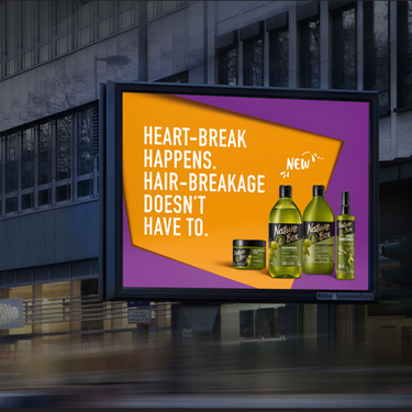
Nature Box has funky, colorful bottles with weird retro font (okay, okay, they're ugly). What was a weakness for Nature Box' brands perceived naturalness, we turned into a powerful differentiator in the global relaunch of this brand. Resulting in considerable growth in awareness and market share. Of course, talking avocados with cowboy boots and giving a macadamia nut a rhineland accent boosted awareness quite a bit as well.
TVC · YOUTUBE · OOH

INITIAL CHALLENGE
After the brand launch in 2018, Nature Box was struggling to be taken seriously as a natural care product. The bottle design looked like an energy drink and there was no way to change that. The launch campaign based on little known influencers had not created any sympathy for the brand.
CONTEXT
The market for natural products is crowded and with ubiquitous green-washing, consumer trust is hard to gain. Competing with established players like Wahre Schätze or Herbal Essences who have established their natural credentials over years is notoriously hard for young brands.
CREATIVE SOLUTION
We took a strategic two-step approach.
First, we relaunched the brand under new positioning, reflected in completely revamped CI and a bold, self-aware brand voice. This created the awareness we previously lacked, while in the background, client teams worked on verifying Nature Box with the prestigious ECOCERT certification.
Second, the moment the certification came through, we launched the next step of the campaign, introducing Nature Box ingredients as fluid brand devices. In other words: we made avocados and argan nuts yell and scream about the fact that we were now officially certified.
81%
2.0%
1.7
Market share growth
34%
Awareness Growth


